(In the spirit of Julie Waters, whose critiques of misrepresentations and false equivalencies helped keep us all on a firm footing. – promoted by NanuqFC)
Folks, Dr. Olgiati in freshman year Chemistry at Saint Michael’s College would have been appalled by some of the things I’ve been seeing on a daily basis in American Political Charts and Graphs.
I’ll start with a classic. The Laffer Curve. It was made famous by a conservative economics professor who was trying to illustrate something to Donald Rumsfeld and Dick Cheney and was drawn on a napkin in one of the most important moments in voodoo economics. The laughable Laffer breaks two of the golden rules of statistical visual representation.
#1- Define some freaking units
#2- Describe where the data used to plot your curve or make your graph comes from.
The Laffer Curve has two “real” data points. Tax revenue at zero and 100% tax rates really will be zero. Everything else is a complete fiction, imagined and used to promote supply-side economics for 30 years. There is no greater argument for the need to increase resources for STEM education than the fact that Americans were willing to swallow this as actual economic information.

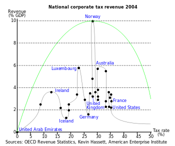
Here’s a more realistic “curve” set against the backdrop of the B.S. one. Oh, and by the way, the “tax rate” represented here as the U.S. point is the on the books corporate rate, not the effective rate after all of the loopholes, credits, subsidies and kickbacks that get paid.
A recent post on mediamatters.org included this latest piece of misleading chart art from my favorite people at Fox:
http://mediamatters.org/blog/2…

This little gem kills me. The right axis arbitrarily starts at 34%? WTF? Looks like a huge increase right? Wrong:

For my sanity’s sake. Please look at the units. Please question the curve. Do not be bullied by the bar graph. Stand up people! Use that cerebrum!
It would truly be awful if we went back to Clinton’s top marginal rate, because I hated all that prosperity…
I’ve run into this many times over the years. Several things stand out.
In the case of the bar graph, people can sometimes be forgiven because spreadsheet programs like Excel have default settings that produce misleading graphs like the one above. For reasons I don’t understand, the vertical axis never starts at zero unless there is a data point near zero. Otherwise, you have to change the setting yourself.
Having said that, it does seem odd that more of those who create the graphs don’t recognize the problem and fix it.
On the other hand, there are times when it’s clear that someone intentionally manipulated the graph. In the case shown above, when I use those two data points (35% and 39.6%), Excel creates a bar graph with the vertical axis starting at 32%. The Fox News graph starts at 34% so it appears that they purposefully changed it to leave the impression that it’s even worse than it would appear with the default setting.
In addition, it looks like Fox also altered the width of the bars because the default setting is quite a bit narrower than what is shown. When combined with the not so subtle shading (gradient fill), the effect is to further exaggerate the difference.
Fox also failed to provide any historical context by only offering data for two points in time. Had they shown changes in rates over time, viewers would see that even 39.6% is waay below the top rates prior to Reagan.
Finally, the information presented – the top rates – is part of the now standard narrative about this issue. In fact, very very few people pay at the top rates but we are led to believe that it matters to average families.
All in all, a serious misrepresentation of the facts.
Fair and balanced…
Fox ‘News’ admitted in federal court that they are NOT a news agency, but an entertainment company. The use the same excuse that Rush Limbaugh does.
Fox ‘News’ and Rush Limbaugh both say that it’s perfectly acceptable for them to brazenly and knowingly lie to the American People because they are entertainers.